Overview
Navy Federal is one of the highest rated credit unions in America and is constantly looking for more ways to assist its members. Given the rising debt of their younger members, they are searching for new ways to assist them in reaching their personal financial goals. Navy Federal Credit Union is looking to improve this experience by updating their mobile application to include new budgeting and finance features.
My Role
This is purely a passion project. I am a Navy Federal member who loves their services and wants to help improve their product. My role as a UX designer was to create and design this budgeting feature while adhering to their established branding material.

Problem
As one of the leading credit unions in the U.S., Navy Federal is seeking to improve their member’s overall financial health. Their members enjoy their current app experience when it comes to maintaining personal finances, but find it lacks robust functionality.
The mobile app features focus on spending, and making payments and deposits. Navy Federal would like to round out their offerings by providing users with personalized features that allow them to fully manage their personal finances and create improved budgeting habits.
Objectives
Design a new personal finance management feature that embeds within the current Navy Federal app.
Improve the information architecture and navigation of the app.
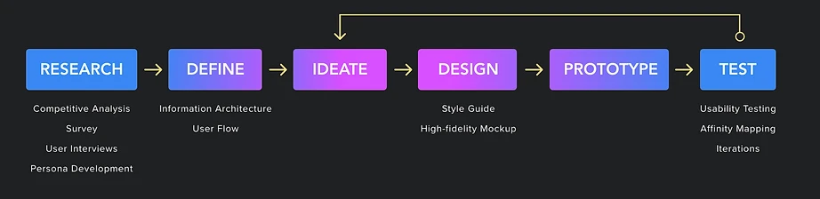
Empathize Through Research
The first step is to understand the problem more deeply. I’ve broken it down into 3 areas:
There are many budgeting apps on the market with a variety of customizable features. While having excellent customer service, there are ways to automate the budget process to make the process simpler and more streamlined for users.
Research solution: Competitive Analysis
Research and analyze the current budgeting apps available, what features they provide for their users, and where Navy Federal could innovate on the process.
There are some ways to manage finances with Navy Federal, but the user must manage most budgeting and planning on their own. Navy Federal needs to see how their app is being used for personal finance needs, and what features their members would like to see added.
Research solution: Survey
Gather qualitative data on what users need to improve their budgeting and what tools they currently use.
Budgeting is a stressful endeavor for most people. Members encounter pain points when self-budgeting, and experience stress when dealing with personal financing.
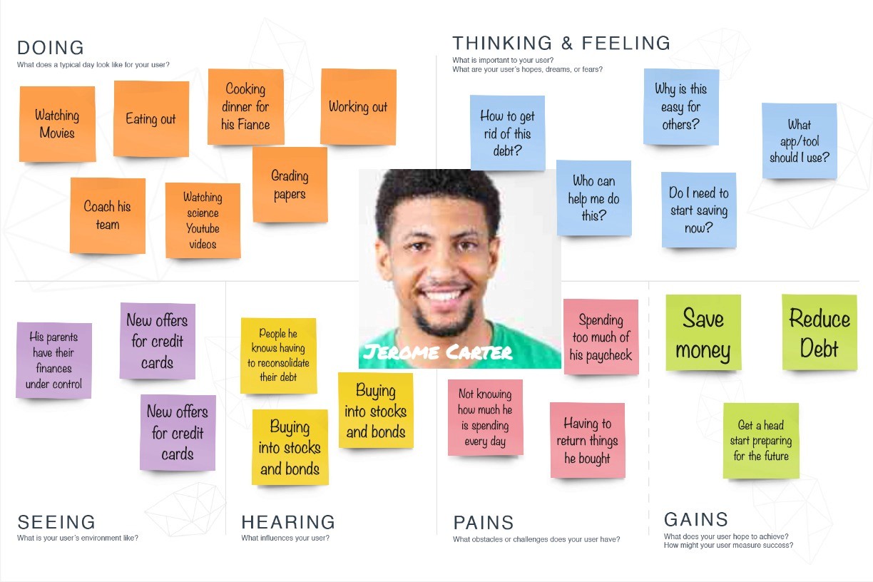
Research solution: Interviews
Conduct 4 user interviews with Navy Federal members and 2 nonmembers to understand how they budget and how they use their banking apps.
Takeaways
This research showed that nearly all users use a third party budgeting app in addition to the Navy Federal banking app. Switching back and forth between these apps leads to frustrations and confusion, but integrating budgeting features with Navy Federal’s app would increase efficiency.
The app is quite simplistic and lacks a lot of features. The majority of users welcomed the introduction of the budgeting feature, anticipating that it would enhance functionality without adding unnecessary bulk to the user experience. Budgeting is only gratifying when progress is being made, so implementing a 'reward' system could significantly alleviate user stress and enhance engagement.

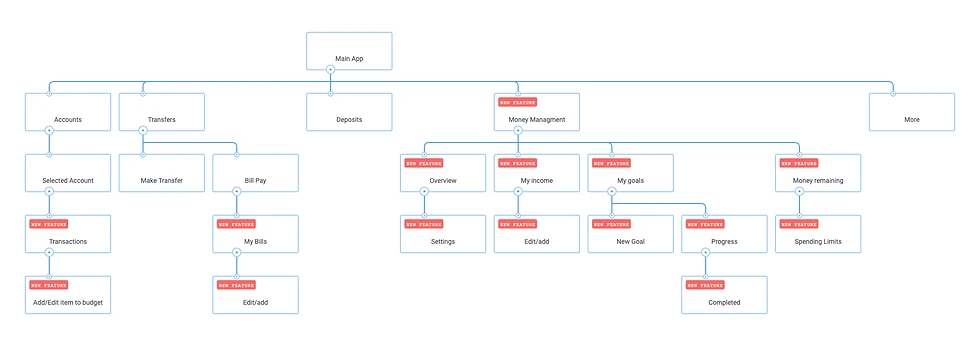
Mapping
Since this project was an update to an existing product, finding ways to incorporate the new feature without taking away functionality was imperative. Based on the feature roadmapping and research, I mapped how the budget feature connects with the rest of the app.
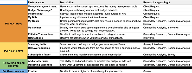
I had to combine a few features to accommodate the budget feature. The tags in red indicate the new design.
After exploring a few flow patterns, I decided to go with a flow in which my persona sees an update to the app and is curious to learn more about budgeting. This flow shows the user's thoughts and feelings as he creates his new budget and starts to see his savings increase.

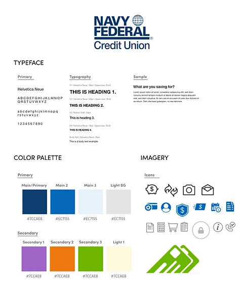
Design System
When approaching the visual design, most of the branding remained the same since the nature of this update is to add to the existing feature set not to overhaul them. The addition of color to income, bills, and goals helps to connect the budgeting aspect with the other functions of the app.
My goal for this update was to adhere closely to the style guide that Navy Federal has developed, incorporating matching fonts and color schemes. My goal for the redesign was to introduce more color to the app. Assigning colors to specific sections of the app helps users quickly recognize what function each section entails. The icons are a combination of ones already in use and others that I created for the updated features.


Usability Testing
I conducted a round of usability testing with 5 participants, 4 of which are current Navy Federal members. Since this is an update, I needed to make sure that new versions of the app perform similarly to the current one. I had participants perform 3 scenarios:
Set up your budget within the app.
Add additional income sources to your budget.
Set up your first “goal.”
Successes:
Felt like the feature integrated well with the app’s other features
Liked having more color/visual aspects to the app
The “goals” feature stood out as something other finance apps lack
Liked seeing all of their financials in one easy-to-understand layout
Common Issues:
All but one tester found the “my goals” title confusing. (more than one suggested “savings goals” instead).
The process of adding income seemed like it could be improved.
Expanding the goals section to incorporate transactions
Outcomes
Although this was just a passion project, I did gain valuable insight into creating new features for established companies. If I were to present this to Navy Federal, I would also include some recommended next steps:
Conduct more usability research into how often users were using the new budget feature
Refine the budget breakdown further
Fully integrate Navy Federal’s established design system UI material
Continue to iterate after gaining feedback from real users
Reflections
I witnessed firsthand the opportunities and challenges in enhancing a product that already has excellent user experience. Redesigns pose a delicate task, especially when catering to a well-established user base with specific expectations. Navigating this terrain while keeping those expectations in mind proved challenging, yet ultimately rewarding.