Overview
ActChain is a concept for a new way to link local and national non-profit organizations with volunteers. The goal is to boost volunteer participation and enhance events that benefit local communities. Frustrated by other volunteer platforms that are either cumbersome or lack a complete flow for engaging as a volunteer, I came up with the idea for ActChain as a new web-based platform to connect volunteers with organizations and events. I rigorously developed the UX to offer as a model for potential clients.

Problem
Numerous volunteer opportunities are always available and organizations always need volunteer assistance. There are many volunteers who are eager to get involved but encounter barriers to access. On the other hand, nonprofits often need volunteers with specific skills suitable for their events. ActChain is for connecting these organizations with the volunteers they need to deepen their impact on their communities.
Objectives
Design a responsive website that encompasses core functionality such as:
Allowing volunteers to search for nonprofits, receive notifications about events, and to connecting organizations with volunteers
Develop marketing material, including a logo, for ActChain.

Empathize Through Research
The first step is to understand the problem more deeply. I’ve broken it down into 3 areas:
Some sites offer excellent features for volunteers searching for opportunities, while others provide robust event or job creation systems for organizers. However, no website effectively caters to both parties.
Research solution: Competitive Analysis
Research and analyze the current volunteer sites to gain a baseline for features and information layouts.
The communication between volunteers and organizations requires enhancement. Volunteers should feel that their time and skills are appreciated.
Research solution: Survey
Reach out to both volunteers and organizers to gather qualitative data about how volunteers seek opportunities and their expectations when volunteering.
Many volunteers struggle to find volunteering events, often relying on in-person interactions or social media to discover them.
Research solution: Interviews
Conduct 5 user interviews including volunteers and nonprofit organizers to find pain points when connecting.
For a more in-depth research breakdown:
Takeaways
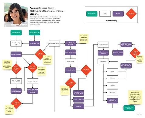
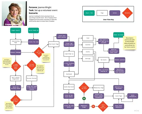
Once the research was complete, I realized that ActChain would essentially be 2 sites in one. First as a portal for volunteers to find opportunities and second as an event platform for the organizers of the nonprofit.
Given the nature of the site, there was a need for 2 personas to highlight the nonprofit organizer’s needs and the volunteer’s needs.
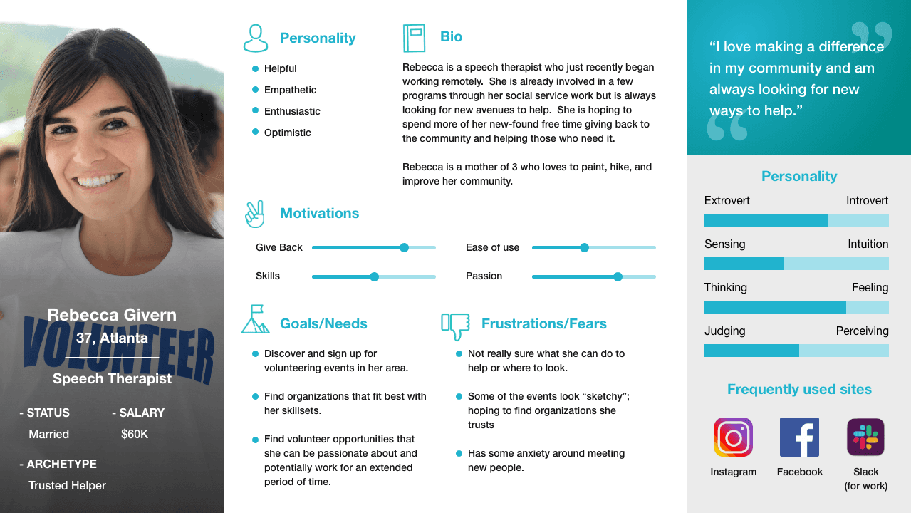
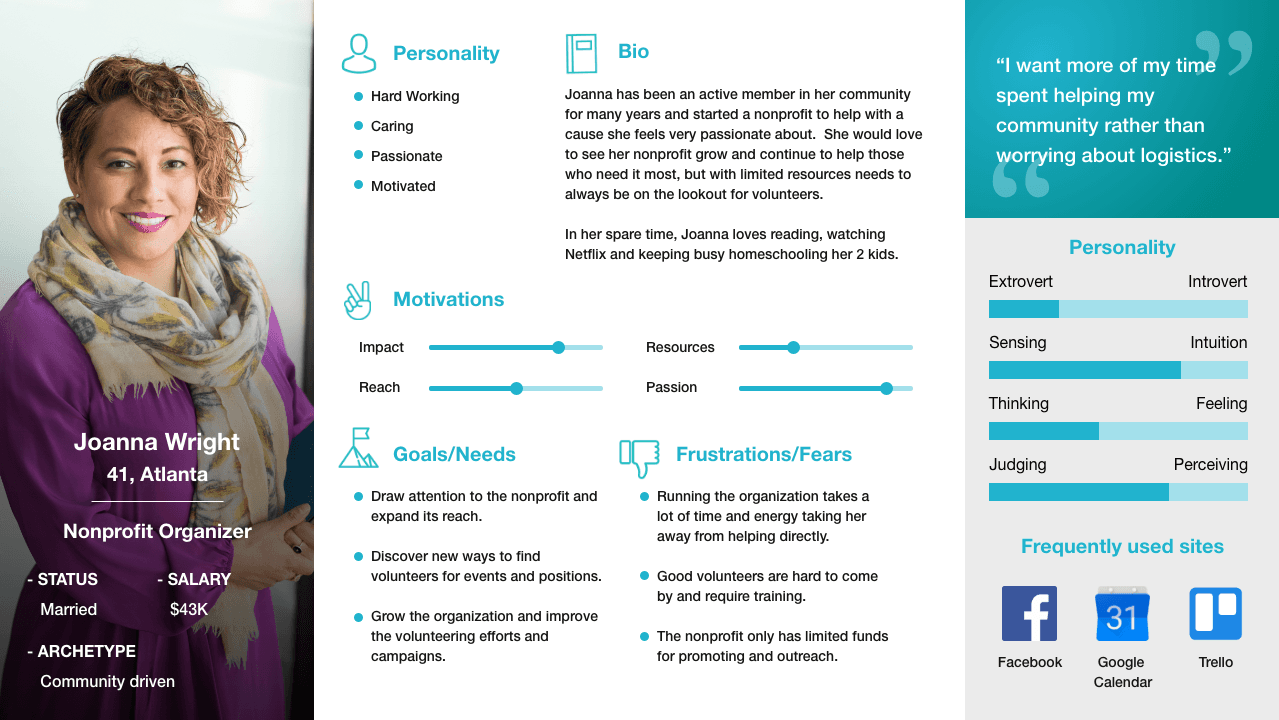
From my survey and interviews, I represented the collective thoughts of both personas and the pains, feelings, and thoughts they go through when volunteering/organizing. Generally, a lack of meaningful communication affects both parties equally.


Mapping
Given the size and scope of this site, narrowing down the essential features was imperative.
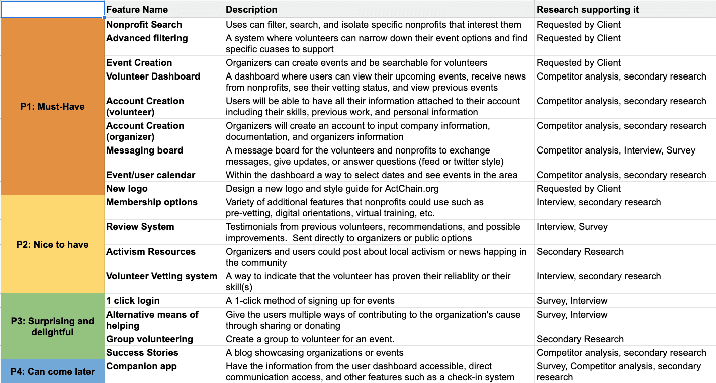
After exploring a few flow patterns, I decided to go with a flow in which my volunteer persona searches for an event, applies for the position, and sends a message to the organizer. The organizer sets up an account, creates an event, and answers a volunteer's question all through the site. Both of these flows accomplish the same goal; connecting the two parties. Both end their journey on the dashboard showing their upcoming events and any updates.
Design Process
Starting with low-fidelity wire frames, I conducted initial usability tests with the desktop size wireframes and made initial iteration ideas based on the results before moving on to the rest of the design.
Design System
Most of the volunteer websites I analyzed had poor UI elements and a wide range of style discrepancies. My assumption is that most of these sites are hosted by nonprofits and do not have the funds to hire a UX/UI designer. I found a new volunteer opportunity!
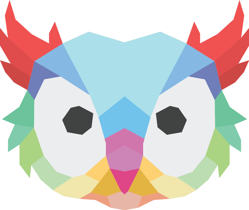
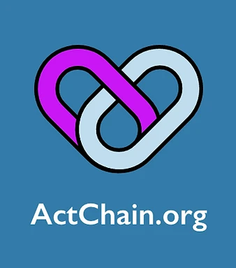
I started sketching out logo designs on paper. I had thought about using typography, but ultimately thought it would be more impactful to have an icon associated with the brand. My goal was to incorporate the linking together of volunteers and organizations illustrating the goal of using this site.
This logo does 3 important things:
Indicates a strong bond between the volunteers and the organizers
Shows how users can become more attached to helping the community
Easy to scale, simple design
I wanted the look and feel to be approachable, especially for first time volunteers who may tend to feel overwhelmed by an overly busy site. I set out to create a fun, vibrant user interface. My goal was to make the process less stressful by using rounded elements, saturated colors, and simple shapes. I went with a mild blue as the primary color with dark purple to contrast as a secondary.


Usability Testing
I conducted a round of usability testing with 5 participants all of which were within the target demographic. I had them perform 3 scenarios:
As a volunteer, find the search page, filter the search, and sign up for an event
Contact the organizer of the event and ask a question
As a organizer, create an event to find volunteers
Successes:
All were able to find the search feature (though 1 did not use the filtering feature)
All thought that the information regarding the event and the position was easy to find
They all understood the purpose of the dashboard and why it is needed for the site
They all appreciated the messaging feature and liked that they were able to reach out to the organizer
No issues with layout, content, or links
Liked the preliminary color choices and button UI
Common Issues:
Problems with event creation
Dashboard improvements both for volunteer and organizers
Getting to the search and event creation pages took some time
Problems with seeing notifications
Not understanding why the organizer has to sign up
Outcomes
If my designs were adopted and developed, these would be the next steps:
Make the adjustments to the prototype based on the usability testing feedback.
Complete the rest of the site pages.
Fine tune all interactions, links, and input fields.
Continue to iterate after gaining feedback from real users.
Reflections
This project was a behemoth. Most of my time was spent in the research phase. There were many iterations during the wireframe usability testing, but that process really helped to shape the site’s IA to accommodate both volunteers and organizers. A single site has the capability of serving more than one function if carefully planned.
I hope a site like this one will help more people to volunteer and give back to their community!